Doodle's Blingtastic Bathroom Reveal
I'd drafted this post ages ago and never got around to publishing, but last night I had a blog request from a friend of a friend, Madeline who I've never met. :) Here you go Madeline - I'm sure this bathroom isn't for everyone, but my 3 year old is pretty pleased with it!
When we built the house we really struggled deciding whether the kids should have their own bathrooms or share a larger bathroom. We landed on two small private baths, literally the smallest they can be while still fitting a standard toilet, sink and bathtub/shower combo, roughly 5'x8'. Though they're both nearly identical in size, doodle's feels a bit more cramped, so I really wanted to make it as extraordinary as possible.
Doodle's requests? Pink, and sparkles. Done and done!
BEFORE:

AFTER:


I'm really hoping the wrinkles fall out of the sequin fabric sooner than later. :) I could have ironed the reverse side, but it's 90" x 90" so my laziness and eagerness to hang it got the best of me after tackling my first ever buttonholes...on sequin fabric. So typical me. LOL
And some of the details:
PS: I painted this room twice in two days. I broke my own rule about getting a sample or at the very least hanging several swatches taped together in the actual space. I just went for it, choosing a color that I thought was compensating for the bright light bulbs and natural light from the window. I was thoughtful about it, and I consider myself really good with paint colors, but this time I was wrong. SO. VERY. WRONG. I hated the color from the first brush stroke, but finished anyway because sometimes it comes around as it dries. It didn't.
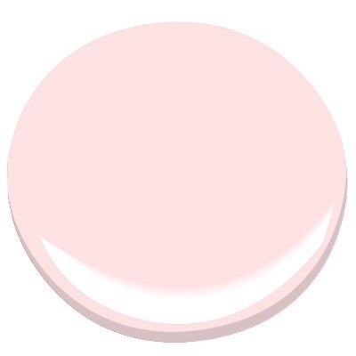
The first color was "Angel Pink" by Benjamin Moore, and in this particular space it looked like a neon pink with blue undertones. Pretty swatch right? Just didn't work in this room.

The final color is "Light Blush" by Glidden. In order to get the walls to appear pale pink and compensate for the very blue-toned lighting in the room from the vanity lights and the window, I had to choose a very orangey-tone pink. To give you an idea, "light blush" shares a color card with "Subtle Peach" and "Frosty Peach Ribbon." I like it much better, and I don't get an instant migraine looking at it. :) The peach paint ends up looking like the Angel Pink above on the walls. All's well that ends well.

This last photo with the mirror is pretty true to life, though it's photographing a bit saturated in the pics with the shower curtain. I'm sure the sequins are just confusing the heck out of my camera!
So that's it for the blog for a while. I'll probably pick it back up once we kick off our pool and backyard extravaganza project, but that probably won't even be a twinkle in our eyes until the end of the year. :)
When we built the house we really struggled deciding whether the kids should have their own bathrooms or share a larger bathroom. We landed on two small private baths, literally the smallest they can be while still fitting a standard toilet, sink and bathtub/shower combo, roughly 5'x8'. Though they're both nearly identical in size, doodle's feels a bit more cramped, so I really wanted to make it as extraordinary as possible.
Doodle's requests? Pink, and sparkles. Done and done!
BEFORE:

AFTER:


I'm really hoping the wrinkles fall out of the sequin fabric sooner than later. :) I could have ironed the reverse side, but it's 90" x 90" so my laziness and eagerness to hang it got the best of me after tackling my first ever buttonholes...on sequin fabric. So typical me. LOL
And some of the details:
 |
| Vidrepur Snow White Iridescent Recycled Glass Mosaic Tile - super hard to photograph!! |
 |
| The shower curtain is a allover sequin fabric in blush pink with taffeta backing. |
 |
| I've had this silver brocade fabric in my stash for years - I bought a remnant to use for a table runner that never came to be at our last house! Just a little mini cornice to dress up the top of the window without blocking any light. I bought a $4 pair of tulle/netting curtains from Ikea and cut them to 30" length and hung them like a cafe curtain for privacy. I used some of the leftover for the gathered bow effect here. |
 |
The mirror was my first stab at silver leafing. It was kind of fun, and didn't make nearly as big a mess as everyone describes. No doubt about it, spray paint cannot achieve a reflective metallic finish like leafing.
|
 |
| Towels are "Pink Ice" from Martha Stewart for Macys |
PS: I painted this room twice in two days. I broke my own rule about getting a sample or at the very least hanging several swatches taped together in the actual space. I just went for it, choosing a color that I thought was compensating for the bright light bulbs and natural light from the window. I was thoughtful about it, and I consider myself really good with paint colors, but this time I was wrong. SO. VERY. WRONG. I hated the color from the first brush stroke, but finished anyway because sometimes it comes around as it dries. It didn't.
The first color was "Angel Pink" by Benjamin Moore, and in this particular space it looked like a neon pink with blue undertones. Pretty swatch right? Just didn't work in this room.
The final color is "Light Blush" by Glidden. In order to get the walls to appear pale pink and compensate for the very blue-toned lighting in the room from the vanity lights and the window, I had to choose a very orangey-tone pink. To give you an idea, "light blush" shares a color card with "Subtle Peach" and "Frosty Peach Ribbon." I like it much better, and I don't get an instant migraine looking at it. :) The peach paint ends up looking like the Angel Pink above on the walls. All's well that ends well.

This last photo with the mirror is pretty true to life, though it's photographing a bit saturated in the pics with the shower curtain. I'm sure the sequins are just confusing the heck out of my camera!
So that's it for the blog for a while. I'll probably pick it back up once we kick off our pool and backyard extravaganza project, but that probably won't even be a twinkle in our eyes until the end of the year. :)


Comments
Post a Comment