The Office Reveal...Take 2!
Chances are if you're reading this, you know I've been redesigning the office only months after moving into our new house, at which time the office was completely decorated in a jewel toned peacock-inspired scheme. Lots of people have told me I'm crazy to re-do it, either because they can't imagine dedicating this much time to a single room, or because they're politely trying to imply they loved it as is. :) Maybe some of you did truly love it, who knows?! But after literally like a day, I didn't love it, and in fact, I hated it. In a vacuum it was kind of cool, but it was very visible from the main living area, which is a far cry from mod, wacky peacock colors. It was the odd man out and needed reconciliation with the rest of the house.
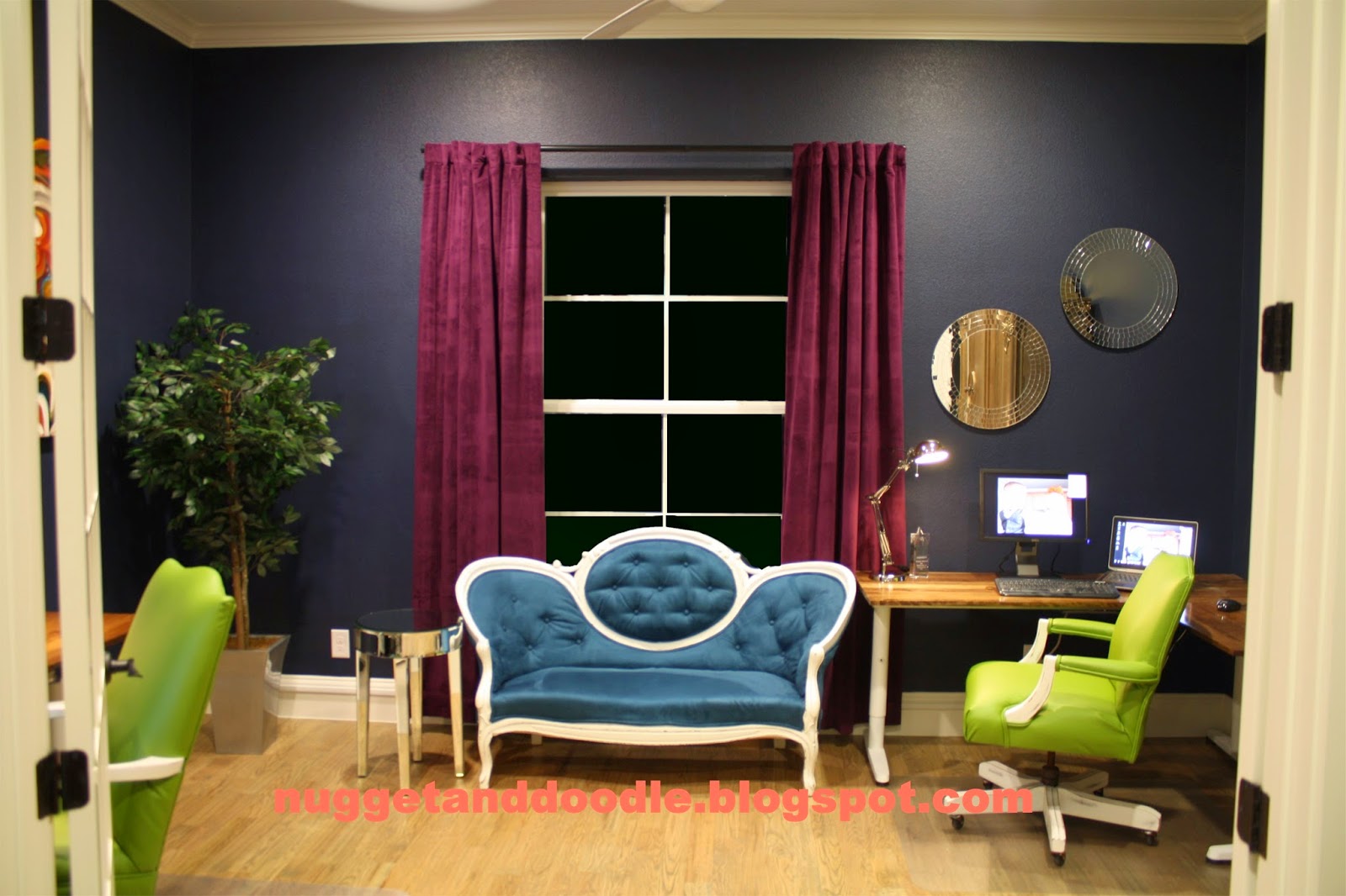
Just in case you haven't seen it a million times already, here is what the office looked like before:
It felt really dark in here too, which was depressing. We work from home, so we are in this room at a minimum from 7am to 4pm Monday through Friday not counting personal time on the computer, paying bills etc. The first change I made as soon as physically possible was the wall color! The delay was because I refinished a dresser for my cousin and Godson's nursery and it ate up the workshop space for a while and I didn't want to have to move the armoire twice. So once the dresser was packed up and shipped out (I hope to blog about all the nursery decor soon too if she EVER sends me final photos - hint hint Bean - no excuses having a days old baby!), we moved the armoire and I painted. By the way I very nearly painted the walls the same color as the rest of the house, and the irony is not lost on me that that's the color it was before I painted it navy blue. :) Ultimately I decided on more color on the wall and more neutral area rug. The wall color is called Waterscape by Sherwin Williams, though I color matched it with Behr Ultra Premium Plus for the beefy primer built in. The navy was so dark and I had visions of having to do another 4 coat paint job. Kind of in love with this premium behr paint though because I nearly got away with just 1 coat even on top of the navy!
Here's the swatch though it's much airier than the swatch looks:
Here's a mid-process photo from my phone. The colors are like night and day, almost literally, right?
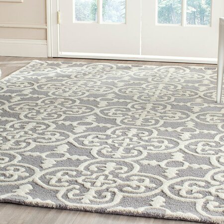
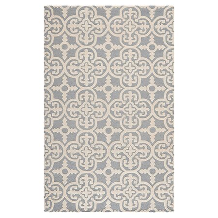
We chose the rug in conjunction with the wall color, partly because they're the two biggest surface areas in the room, and partly because we never ended up finding a rug that worked in the grand scheme of the peacock version of the room. After a couple weeks of agonizingly browsing thousands of rugs online and either not being sure about the color, the pattern, the material, the thickness, the price, or the availability in the size I wanted... I found this one at Joss and Main. I had it in my shopping cart and was about to check out when the little voice in my head kept telling me I'd seen this rug before. It was called something different as Joss and Main usually alters the names of the product to make it seem more curated, but I knew I'd seen it before. So I did a google image lookalike seearch and found it immediately at Overstock. Not only was it a tiny bit cheaper, but Overstock has free shipping, faster shipping, and their return policy is much easier if the rug didn't work out for some reason. Score!!
 |
| It was this image that sold me - the flat, 2D pics of rugs used online usually does the rugs no justice whatsoever! |
Once the walls were painted and I had the rug in hand, we re-arranged our desks a bit. I wasn't looking out the window as much as I wanted in the old configuration, and Brent's desk prevented the french doors from opening all the way. It also ran the risk of our little ones slamming the desk with the glass panes of the french doors. Ok, I should say, it ran the risk of their repeated slamming the door actually breaking the glass. :) The new configuration with us on the same wall allowed us to get a single area rug for both our desks. It's still not perfect, but I'm soooo much happier with my position by the window. From a design perspective it's not ideal looking into the room, but since I have to actually work here I went with function over form this time. That said, we're already talking about re-doing our desks with beefy wooden legs in a distressed white paint, and a thicker, plank style top stained in the same color as it is now. The modern desk frame isn't doing it for us anymore, but it was a great temporary solution to get our office up and running quickly in the beginning. I'll let you know if we decide to build new desks! The furniture arrangement visually cuts down the length of the room, but the lighter color opens it up so I think it's a wash in terms of feeling bigger or smaller. Or maybe a better way of putting it is that it FEELS bigger being in the room, but looks smaller on camera due to furniture arrangement.
I mentioned that I was toying with some different color options for the office chairs, and I ordered swatches and they were worlds apart from the swatches online. So important to order swatches!! I hated all but one, and ended up ordering 7.5 yards of that color. I went with the faux leather they label as just "Blue," not light blue, or denim blue or country blue. Just blue. This is the online swatch photo, but in person it has NO green undertones whatsoever. It's definitely more of a cornflower blue in person. A strong color, but not wild within the context of the office.
I was planning to reupholster both chairs again myself. But when mid-September rolled around and I started planning this room in late June, and with the office nearly complete the apple green chairs were seriously upsetting. So I found an upholsterer to do it for me. The rates were totally reasonable. Like, cheaper than if I put a small value on my time, because it takes me so much longer being a hack DIY hobby upholsterer. He even came to pick them up and drop them off and it took him 3 days. So. Worth. It!
Here they are:
I was really having a hard time narrowing down my window treatment search. I was hell bent on something light and airy, probably because of the heaviness of the old curtains. And I was hoping to find a print rather than a solid, but a printed, airy curtain that comes in 120" length is not easy to find! Mom and I were out shopping one day and stumbled on this collection at JCPenney. I've always liked their window treatment selection, especially online, but in this case, the photos of this whole collection are so underwhelming so I would have passed right over them if shopping online.
Anyway, the curtains that I really fell in love with are the periwinkle blue that are shown pulled way to the left with the hand. It has a white paisley print on it and the color was just luscious! In store, they only stocked 84" length. But all the signage said they carried up to 120" online. So I went right home and looked them up to buy the 120" long blue with white paisley and that design was only available in the 84" length. Huh? So I called JCP to see if they could see something in the system that I couldn't because the packages and signage all said they had the longer lengths. She said the longer length didn't exist in the system, and as such she couldn't tell if it's ever going to be available. Meanwhile, back at the ranch, I'd been photoshopping the room to death, and discovered the periwinkle curtains were just too much and read too solid, but the airy white ones with slate blue leaf pattern (middle in this photo) were just right! Aaaaaaand available in 108". It's not 120" but I cheated off the floor a few inches and they look fine. Took advantage of the 40% off sale too. Seriously though, if you're ever stalking something at JCP and it's NOT currently on sale, wait like 24 hours and it will be. :)
I found this mirror at Kirklands and really loved the style. However, when I got everything else in the room, the colors weren't quite right.
So, I painted just the outer row hoping the leafy green in the middle would work. It didn't. So then I painted the color I'd used on the outer layer over the middle leafy green, and then painted the outer layer again in a darker custom mix to get a dark country blue-violet color. I absolutely love how it came out.
By now you've seen the posts on the armoire's second makeover, the lampshades and the custom hanging file storage boxes, and the rustic wooden wall art, sort of, though that post was more about nugget's wall art.
So that's really everything, aside from a look at the office all put together. I should probably take photos at night to make it a more apples to apples comparison to all the "before" photos. Before I was unable to photograph the room during the day because of the backlight from the window. I have the same problem now, but it doesn't strip out all the detail like it used to. Oh well...
Here goes:
Most importantly, the view into the office from the rest of the living area and kitchen is so much more harmonious now which was probably the biggest reason I had to re-do this room asap. The office looks like it belongs in our house. :)

I hope you like it - we're really enjoying it. I've still got a few odds and ends to add... I think I'm going to upholster a small accent chair for the corner by the mirror and horse art. It's a chair I was planning to use in the guest room but think it'll get more use in the office. The fabric I bought is a charcoal gray linen, which would work nicely in the office. I want a really pretty quilt that I'll either hang on a hook (Brent tends to like it cooler than I do), or maybe drape over this new chair. I also need to get a something more rustic/cottagey to hold my pens, sharpies, etc. that better fit the new style of the room. My Romero Britto mug will move to the coffee cabinet. I think eventually I'll hang some sort of bulletin board too - maybe on the wall behind the tree and where the french door opens. We need a place to easily access business cards, paperwork to follow up on, hang a calendar etc. And the wall over Brent's desk is feeling pretty sparse too, and I had plans for it, but hesitated and now I'm just not sure. I'll let the rest of the stuff organically happen over time. For now I'm really happy in our new office. Hope you like it. I'm sure it's not as "wow" on camera as the bold peacock theme, but it's SO much more livable. :)
We've got a lot of work going out outside, so I hope to update you on all of that soon, plus the special nursery post for my most special Godson Cole!


I loved the office before but it really looks awesome now!
ReplyDelete